The Blurb
It’s the start of a new year, a new decade, and in my case: a new wardrobe. In the inevitable ‘new-year-new-me’ tumult, I found myself booking in for a 1-2-1 colour consultation at Chromology in an effort to feel like my best self without any drastic crash diets or regrettable haircuts. Chromology, founded by Gabriella Winters, is a colour analysis consultancy where – using the ‘12-tone Sci\Art method’ – clients can discover their unique relationship to colour and learn how to enhance their genetic appearance through clever clothing and makeup choices. Whereas ‘getting your colours done’ had always sounded a bit naff to me, hovering in Avon make-up-party territory; Chromology’s website spoke of a modern holistic approach and showcased people looking radiant and confident, with not a two-piece royal marine blue suit in sight. And I’m not disappointed when I go to try out the process for myself.
The Credentials
Gabi is a branded space designer with a passion for colour psychology and colour application. She designs events, tv sets and retail interiors for portfolio clients such as Stella McCartney, YouTube, IKEA, Adidas, Barclays Bank, Hendricks Gin and many more. She holds a degree in Visual Display & Design and qualifications in Applied Colour Psychology and Personal Colour Analysis.
Her website states that ‘with 20/20 eyesight and perfect colour vision, she is one of the UK’s very few qualified experts on personal colour’ and I am certainly extremely impressed by the knowledge she demonstrates during our time together. Additionally to the extensive educational qualifications on her website, Gabi is also genuinely warm and friendly, easy to like, and has a knack for explaining complex ideas about colour in an easy-to-digest way so that the process (detailed below) is an informative and impactful one, rather than an overwhelming one.
Her studio is conveniently located close to Victoria station and indeed, Gabi has clients visit from all over the country, and even the world; such is her reputation as the go-to colour expert in London.
The Process
“In the right colours your eyes sparkle, your skin glows, your presence is calm and your personality shines with confidence. In the wrong colours your eyes look indistinct, your skin appears patchy, your presence is weak and anxious and your personality just seems unexceptional.” – Gabi Winters
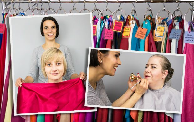
Once we enter the studio, Gabi sits me in front of a huge mirror and two extremely bright (and unforgiving) full-spectrum (daylight) lights. On my right, a massage table is stacked high with bundles of coloured cloth.
Drape after drape of coloured cloth is wrapped across the front of my torso, and each one is compared to another (a little bit like those futuristic glasses with the interchangeable lenses you have to wear at the optician’s) to see which is ‘better?’ or ‘worse?’ except it’s not as simplistic as that. Colours that I like at first glance, and may well have tried on and happily purchased if I’d been shopping, are soon revealed to highlight the redness in my complexion, or to accentuate the grey shadows under my eyes (I’ve been asked to attend the process bare-faced to really let the colours show up on my skin); whereas colours I would steer a clear berth from while rummaging through clothes rails seem to almost airbrush my features, make my skin glow, and lift my complexion. Along with ‘lift’ we are looking for colours that ‘smooth’, ‘cream’, ‘flow’, and ‘enliven’ my face.
Seemingly very similar shades of red/blue/green are revealed to be drastically different in the way my eyes, hair, and skin tone react to them. As Gabi continues to drape and undrape me, with a practised dexterity and an almost continuous stream of commentary (“See how the energy flows here?” “No, not this one; this one makes you look stern, like a headteacher.”, “Yes! Look at how this red brightens your eyes!”) I am intrigued and surprised to be able to observe a real discernible difference between a ‘warm’ red’s effect on my skin to a ‘cool’ red.
Whereas before, I would have declared that I was someone who ‘didn’t wear red’; now I see that I can wear red, it just needs to have the right undertones. By a process of meticulous elimination that is based on the Sci\Art Colour Clock, we arrive at my colour type: Dark Autumn. This is best explained with the visual references below. In these first two photos, I am draped and lipsticked in ‘Dark Autumn’ (my ideal colour type):

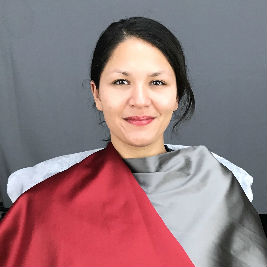


 .
.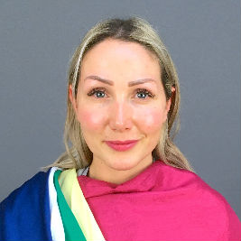
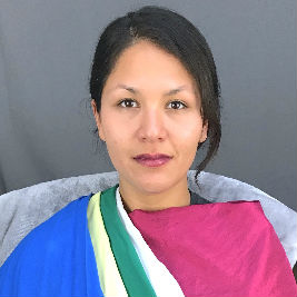
In the True Summer Drapes (cooler and lighter than my colouring) we are now several steps away from my ideal colours and my skin appears, ashy, blotchy and visibly greyer under the eyes and around the lips in particular – not to mention the lipstick looking a little too vampy. My eyes are tired and recede into the background, being overpowered by the bright drape colours beneath. The overall impression is that of ‘lack of sleep, ineptness and somewhat lost and in need of guidance rather than that of confidence, authenticity and radiance’. The drapes seem to ‘turn off the light’ around my face and take away my natural glow, leaving me looking ‘dull and feeble'(ouch!). The picture on the left, however, shows a True Summer client looking radiant and energised in exactly the same colours.
Harmonisation
With a book of ‘Dark Autumn’ colour swatches, Gabi shows me how to ‘harmonise’ the colours on the cards to a selection of clothes and makeup. I like this part of the process especially because it allows for some creativity beyond the colours of the drapes and the cards. The colours that suit your ‘type’ don’t necessarily have to match the colour swatch exactly, they just have to be in the same family: they should complement each other rather than overpower each other or disappear when held next to each other for comparison. My colour wheel held against my black coat looks ok-ish. But when held against Gabi’s black leggings (that are more charcoal in tone) the combination looks refined, elegant, expensive.
It’s these subtle nuanced differences in colour and tone that make the colour process such an intriguing one, and Gabi is skilled at explaining both the scientific method behind the process and the practicality of applying it to your own everyday life. She sets me some homework which is to go home and start to colour check my wardrobe. It’s definitely a harder process without Gabi’s expert eye, but I will keep practising.
Try out the 1-on-1 Colour Analysis session for yourself; £375 for a 1/2 day session. www.chromology.co.uk; +44 7753 350 734
Gabi’s Guide to Colour Matching at Home

To prepare:
- Gather as many red coloured items of clothing, accessories, blankets tea towels etc as you can find around the house (and by red I mean everything from oranges and peaches to pinks and purples as well, not just literal reds). If there are not many red tones in your home, you can switch to shades of blue (inc teals and violets) or shades of green (inc limes, mints and turquoise colours) instead, but generally, reds tend to be easier to analyse with if you have them.*If you are a black and white sort of person then raid your home accessories, your kids’ rooms or even your mum’s house if needed be to find some ‘colourful colours’ for the exercise.
- Find a well lit neutral space by a window and bring a mirror near to it (try to find a mirror in which you can see from waist level to the tip of your head easily).
- Remove all colourful looking objects from your view (you don’t want to see a blue curtain or orange lamp while you’re working as they can very easily confuse the information you are collecting), and if you don’t have any neutral coloured walls in your house try and drape a grey or white sheet or blanket behind you (on a door or similar), you want your environment to look as colour deprived as possible for this exercise.
- Wear a white or grey top and tie your hair back if long or tuck behind your ears if short (hair can block the way of the reflected light, which makes it harder to see visual clues).IMAGE
To self-analyse:
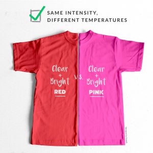
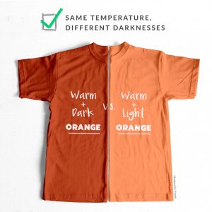
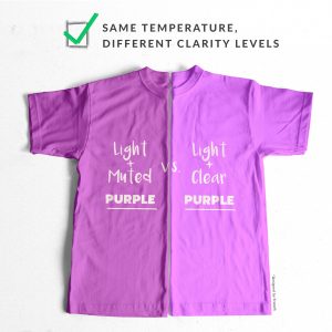
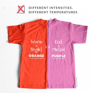
- Take a look at the selection of colours you’ve gathered and try to create some comparable pairings. Colours have 3 dimensions (lightness-darkness, warmness-coolness and greyness-clearness), so the idea is to try and compare like for like colours, only changing one dimension at a time. Here are some visual examples of good colour pairings versus some a less useful colour pairings:
- Pick up a pair of colours and drape them under your face, one garment over the other. While looking at your face in the mirror, peel the top item off to reveal the colour underneath. Place the top colour back and peel it off again a few times and look for differences that the two colours create in your appearance. Keep your eyes on your face the whole time you are ‘draping’ and not on the colours or you might miss some clues.
- Have a pen and paper at the ready and take notes of your findings with each comparison. When observing the effects of colour reflections, note down good and bad points for each colour, for example, the greyish peach evened my skin tone more, but my eyes looked more out of focus that with the dark tomato red, which made my skin blotchier but gave my features better definition; or, the bright orange made my skin look tanned, but my eyes glow warmly while the bright fuchsia made my skin look more natural in tone, but my eyes lacked a little depth o the light greyish purple brought the attention to my eyes, while the darker more intense purple brought red blotches to my skin surface which distracted focus from my eyes etc. Evaluate findings:
- Look for common patterns in your findings, for example, clearer colours seem to even my skin while greyer tones make it appear more blotchy; or, darker colours give me better definition while lighter colours make my chin disappear; or, cooler colours make my skin look healthier while warmer colours make it look jaundiced or muddy etc.
- Compare better-performing colours against each other to narrow down on your dimensions even more, for example: if clearer colours made you look more glowing (compared to greyer tones) then try to compare cooler clear colours to warmer clear colours to try work out your optimal colour temperature, or try to compare lighter clear colours to darker clear colours to figure out your best darkness level; or, if warmer colours seemed more natural-looking than cooler tones then try to compare clearer warm colours to more muted ones to find your best level of vibrancy or compare lighter warm tones to darker ones to work out your optimal darkness levels and so on.


